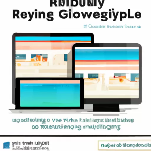
As technology advances, so does the way we access the internet. Gone are the days of having to be tied to a desktop computer to access the web. Now, with the rise of mobile devices, it's essential for websites to be able to adapt to any device. Enter responsive web design – a way of designing websites that ensures they look great and function properly on any device. In this article, we'll explore the concept of responsive web design and how it can help you create a website that looks great on any device.
"Informal: Adapt to Any Device with Responsive Web Design! Formal: Optimize Your Website for Any Device with Responsive Web Design!"
As technology advances, so does the way we access the internet. Gone are the days of having to be tied to a desktop computer to access the web. Now, with the rise of mobile devices, it's essential for websites to be able to adapt to any device. Enter responsive web design – a way of designing websites that ensures they look great and function properly on any device. In this article, we'll explore the concept of responsive web design and how it can help you create a website that looks great on any device.
What is Responsive Web Design?
Responsive web design is a type of web design that allows a website to adapt to the size of the user’s device. It is a way of creating a website that looks great on any device, from a desktop computer to a mobile phone. Responsive web design is becoming increasingly important as more and more people are using their phones and tablets to access the internet.
Here are the key elements of responsive web design:
- Fluid grids: A fluid grid is a grid that is based on percentages instead of fixed widths. This allows the grid to adapt to different screen sizes.
- Flexible images: Images should be able to scale up or down depending on the size of the device. This can be done using the max-width property.
- Media queries: Media queries are used to determine the size of the device and then apply different styles depending on the size. This allows the website to look different on different devices.
- Responsive design: Responsive design is the process of creating a website that looks great on any device. This involves using the elements mentioned above to create a website that is optimized for any device.
Responsive web design is becoming increasingly important as more and more people are using their phones and tablets to access the internet. It is important to make sure that your website looks great on any device, and responsive web design is the best way to do this. By using the elements of responsive web design, you can create a website that looks great on any device.
How does Responsive Web Design work?
Responsive web design is a technique used to create websites that look great on any device, from desktop computers to mobile phones. It uses a combination of HTML, CSS, and JavaScript to create a website that is optimized for different screen sizes and resolutions. Heres how it works.
- Fluid Grids: Responsive web design uses a grid-based layout that is flexible and fluid. This means that the layout of the website will adjust to fit the size of the device it is being viewed on. This allows the website to look great on any device.
- Flexible Images: Responsive web design also uses flexible images that can be resized to fit the size of the device. This ensures that images look great on any device, regardless of the size of the screen.
- Media Queries: Media queries are used to determine the size of the device and then apply the appropriate styles. This allows the website to look great on any device, regardless of the size of the screen.
- JavaScript: JavaScript is used to create interactive elements on the website. This allows the website to be more interactive and engaging on any device.
Responsive web design is a great way to ensure that your website looks great on any device. It uses a combination of HTML, CSS, and JavaScript to create a website that is optimized for different screen sizes and resolutions. With responsive web design, you can be sure that your website looks great on any device.
What are the benefits of Responsive Web Design?
Responsive web design is a must-have for any website in today’s digital world. It’s a design approach that ensures your website looks great and functions properly on any device, from desktop computers to mobile phones. Responsive web design has many benefits, and here are just a few of them.
- Improved User Experience: Responsive web design ensures that users have a great experience no matter what device they’re using. This means that they can easily navigate your website and find the information they need without having to zoom in and out or scroll left and right.
- Better SEO: Search engine optimization (SEO) is an important part of any website. Responsive web design helps improve your SEO by making sure that your website is optimized for all devices. This means that your website will be more likely to show up in search engine results.
- Cost Savings: Responsive web design can save you money in the long run. Instead of having to create separate websites for different devices, you can create one website that works on all devices. This means that you don’t have to pay for multiple websites.
- Faster Load Times: Responsive web design can help improve your website’s load times. This is because the website is optimized for all devices, so it won’t take as long to load on any device.
- Better Branding: Responsive web design can help improve your brand’s image. This is because your website will look great on any device, which will help create a positive impression of your brand.
Responsive web design is an important part of any website. It can help improve user experience, SEO, cost savings, load times, and branding. If you’re looking to create a website that looks great and functions properly on any device, then responsive web design is the way to go.
How can I make my website responsive?
Are you looking to make your website responsive? If so, you’ve come to the right place! Responsive web design is an essential part of any website, as it allows your website to be viewed on any device, from a desktop computer to a mobile phone. Here are some tips to help you make your website responsive:
- Start with a mobile-first approach. This means that you should design your website for mobile devices first, and then scale up to larger devices. This will ensure that your website looks great on any device.
- Use a responsive framework. There are many frameworks available that will help you create a responsive website. These frameworks will provide you with the necessary code to make your website responsive.
- Test your website on different devices. Once you have created your website, it is important to test it on different devices to make sure that it looks and functions correctly. This will help you identify any issues that need to be addressed.
- Optimize your images. Images can take up a lot of space on a website, so it is important to optimize them for different devices. This will help ensure that your website loads quickly on any device.
- Use media queries. Media queries are a powerful tool that allow you to create different styles for different devices. This will help you create a website that looks great on any device.
By following these tips, you can make your website responsive and ensure that it looks great on any device. Good luck!
In conclusion, responsive web design is a powerful tool that can help businesses reach a wider audience and provide a better user experience. By adapting to any device, it ensures that websites are accessible to all users, regardless of the device they are using. Responsive web design is an essential part of any modern website, and businesses should take advantage of it to ensure their website is as user-friendly as possible.
