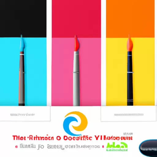
Are you looking to create the perfect stationary design but don't know where to start? Choosing the right colors for your stationary design can be a daunting task, but it doesn't have to be. With a few simple tips, you can easily pick the perfect colors for your stationary design that will make it stand out and be memorable. In this article, we'll explore how to choose the right colors for your stationary design.
"Informal: Discover the Perfect Colors for Your Stationary Design!Informal: Pick the Perfect Colors for Your Stationary Design!"
Are you looking to create the perfect stationary design but don't know where to start? Choosing the right colors for your stationary design can be a daunting task, but it doesn't have to be. With a few simple tips, you can easily pick the perfect colors for your stationary design that will make it stand out and be memorable. In this article, we'll explore how to choose the right colors for your stationary design.
What colors should I consider when designing my stationary?
When it comes to designing your stationary, the colors you choose can make a huge difference. Colors can evoke certain emotions and feelings, so it’s important to choose the right ones for your stationary. Here are some tips to help you decide what colors to consider when designing your stationary.
- Think about the message you want to convey: Different colors can evoke different emotions and feelings. For example, blue is often associated with trustworthiness and reliability, while yellow is associated with optimism and cheerfulness. Consider the message you want to convey and choose colors that will help you do that.
- Choose colors that match your brand: If you already have a brand, you should choose colors that match it. This will help create a consistent look and feel for your stationary. If you don’t have a brand yet, you can use colors that you think represent your business or organization.
- Consider the colors of your logo: If you have a logo, you should consider the colors of it when designing your stationary. This will help create a cohesive look and feel for your stationary. You don’t have to use the exact same colors, but you should choose colors that complement your logo.
- Choose colors that are easy to read: When choosing colors for your stationary, you should also consider how easy they are to read. Dark colors on a light background are usually easier to read than light colors on a dark background. You should also avoid using colors that are too similar, as this can make it difficult to read.
- Think about the paper you’ll be using: The paper you use for your stationary can also affect the colors you choose. For example, if you’re using a light-colored paper, you should choose darker colors for your text and graphics. On the other hand, if you’re using a dark-colored paper, you should choose lighter colors for your text and graphics.
Choosing the right colors for your stationary can be a daunting task, but it doesn’t have to be. By considering the message you want to convey, choosing colors that match your brand, considering the colors of your logo, choosing colors that are easy to read, and thinking about the paper you’ll be using, you can create a cohesive and professional look for your stationary.
How can I make sure my colors are complementary?
When it comes to creating a visually appealing design, color is one of the most important elements. But how do you make sure that the colors you choose are complementary? Here are some tips to help you out:
- Understand the Color Wheel: The color wheel is a great tool for understanding how colors interact with each other. It’s made up of primary, secondary, and tertiary colors, and understanding how they work together can help you create a harmonious color palette.
- Choose a Color Scheme: Once you understand the basics of the color wheel, you can start to choose a color scheme. There are several different types of color schemes, such as monochromatic, analogous, and complementary. Each one has its own unique look and feel, so experiment to find the one that works best for your design.
- Use Color Tools: There are a number of online tools that can help you create a complementary color palette. Adobe Color CC is a great tool for creating color palettes, and there are also a number of apps that can help you find the perfect colors for your design.
- Experiment: The best way to make sure your colors are complementary is to experiment. Try out different combinations and see what works best for your design. Don’t be afraid to try something new and unexpected – you never know what you might come up with!
By following these tips, you can make sure that your colors are complementary and create a visually appealing design. Have fun experimenting and don’t be afraid to try something new!
What are some tips for creating a visually appealing stationary design?
Creating a visually appealing stationary design can be a daunting task, but with the right tips and tricks, you can create something that stands out from the crowd. Here are some tips to help you create a stunning stationary design:
- Choose the right colors: Colors can make or break a design, so it’s important to choose the right ones. Consider the colors that will best represent your brand and create a cohesive look.
- Keep it simple: When it comes to stationary design, less is more. Keep your design simple and avoid using too many fonts, colors, and images.
- Include your logo: Your logo is an important part of your brand identity, so make sure to include it in your stationary design.
- Be consistent: Consistency is key when it comes to design. Make sure to use the same fonts, colors, and images throughout your design.
- Use high-quality images: High-quality images can make a huge difference in the overall look of your design. Make sure to use images that are clear and crisp.
- Pay attention to details: Details can make or break a design, so make sure to pay attention to them. Check for typos, alignment, and other small details that can make a big difference.
By following these tips, you can create a visually appealing stationary design that will make a lasting impression. Good luck!
What are the benefits of using a color scheme for my stationary design?
When it comes to designing stationary, one of the most important decisions you can make is the color scheme. Choosing the right colors can make a huge difference in the overall look and feel of your stationary, and can help to make it stand out from the crowd. Here are some of the benefits of using a color scheme for your stationary design.
- It Creates a Professional Look - Using a color scheme for your stationary design can help to create a professional look and feel. By choosing colors that complement each other, you can create a cohesive look that will make your stationary look more polished and professional.
- It Helps to Establish Your Brand - Using a color scheme for your stationary design can help to establish your brand. By choosing colors that are associated with your brand, you can create a recognizable look that will help to make your stationary stand out from the crowd.
- It Can Help to Communicate Your Message - Using a color scheme for your stationary design can help to communicate your message. By choosing colors that are associated with certain emotions or ideas, you can create a look that will help to convey your message in a more effective way.
- It Can Help to Create a Memorable Design - Using a color scheme for your stationary design can help to create a memorable design. By choosing colors that are unique and eye-catching, you can create a look that will help to make your stationary stand out from the crowd.
Using a color scheme for your stationary design can be a great way to create a professional, memorable, and effective design. By choosing colors that complement each other and are associated with your brand, you can create a look that will help to make your stationary stand out from the crowd.
Choosing the right colors for your stationary design can be a daunting task. However, with a little bit of research and experimentation, you can create a design that reflects your brand and stands out from the competition. Consider the psychology of color, the context of your design, and the overall aesthetic of your brand when selecting colors. With a little bit of effort, you can create a design that will make a lasting impression on your customers.
